文章内容如有错误或排版问题,请提交反馈,非常感谢!
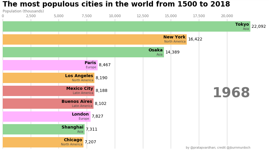
我们经常看到的 Bar Chart Race(柱形竞赛图),可以看到数据的呈现非常的直观。今天就一起来学习下如何生成和上面一样的柱形竞赛图。
1、导入 Python 库
import pandas as pd
import matplotlib.pyplot as plt
import matplotlib.ticker as ticker
import matplotlib.animation as animation
from IPython.display import HTML
2、加载数据集
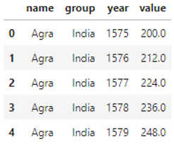
这里使用的是城市人口数据集,加载我们想要的数据:其中,name 为城市名称,group 为城市所在区域。
df = pd.read_csv("data/city_populations.csv", usecols=['name', 'group', 'year', 'value'])
df.head()
3、初步处理数据
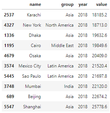
提取某一年的 TOP10 城市:
current_year = 2018
dff = df[df['year'].eq(current_year)].sort_values(by='value', ascending=True).head(10)
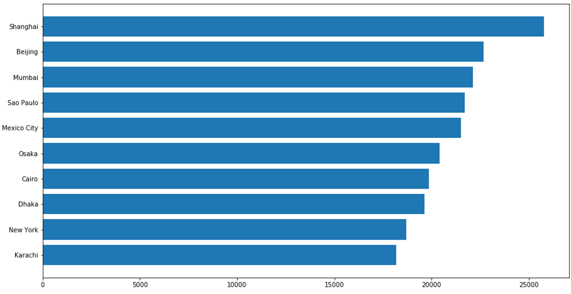
4、绘制基础柱状图
fig, ax = plt.subplots(figsize=(15, 8))
ax.barh(dff['name'], dff['value'])
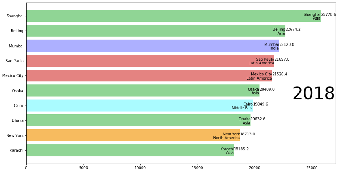
5、调整样式(设置颜色、添加标签)重新绘制图片
colors = dict(zip(
["India", "Europe", "Asia", "Latin America", "Middle East", "North America", "Africa"],
["#adb0ff", "#ffb3ff", "#90d595", "#e48381", "#aafbff", "#f7bb5f", "#eafb50"]
))
group_lk = df.set_index('name')['group'].to_dict()

fig, ax = plt.subplots(figsize=(15, 8))
# pass colors values to `color=`
ax.barh(dff['name'], dff['value'], color=[colors[group_lk[x]] for x in dff['name']])
# iterate over the values to plot labels and values (Tokyo, Asia, 38194.2)
for i, (value, name) in enumerate(zip(dff['value'], dff['name'])):
    ax.text(value, i, name, ha='right') # Tokyo: name
    ax.text(value, i-.25, group_lk[name], ha='right') # Asia: group name
    ax.text(value, i, value, ha='left') # 38194.2: value
# Add year right middle portion of canvas
ax.text(1, 0.4, current_year, transform=ax.transAxes, size=46, ha='right')
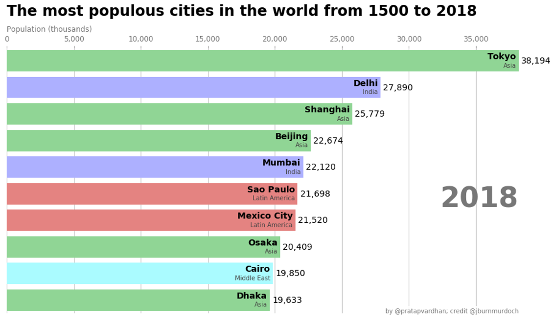
6、完善代码,将代码整合进函数
优化内容:
- 文字:更新字体大小,颜色,方向
- 轴:将 X 轴移到顶部,添加颜色和字幕
- 网格:在条后面添加线
- 格式:逗号分隔的值和坐标轴
- 添加标题,字幕,装订线空间
- 删除:框框,y 轴标签
fig, ax = plt.subplots(figsize=(15, 8))

def draw_barchart(year):
    df_f = df[df['year'].eq(year)].sort_values(by='value', ascending=True).tail(10)
    ax.clear()
    ax.barh(df_f['name'], df_f['value'], color=[colors[group_lk[x]] for x in df_f['name'])
    dx = df_f['value'].max() / 200
    for i, (value, name) in enumerate(zip(df_f['value'], df_f['name'])):
        ax.text(value-dx, i, name, size=14, weight=600, ha='right', va='bottom')
        ax.text(value-dx, i-.25, group_lk[name], size=10, color='#444444', ha='right', va='baseline')
        ax.text(value+dx, i, f'{value:,.0f}', size=14, ha='left', va='center')
    # ... polished styles
    ax.text(1, 0.4, year, transform=ax.transAxes, color='#777777', size=46, ha='right', weight=800)
    ax.text(0, 1.06, 'Population (thousands)', transform=ax.transAxes, size=12, color='#777777')
    ax.xaxis.set_major_formatter(ticker.StrMethodFormatter('{x:,.0f}'))
    ax.xaxis.set_ticks_position('top')
    ax.tick_params(axis='x', colors='#777777', labelsize=12)
    ax.set_yticks([])
    ax.margins(0, 0.01)
    ax.grid(which='major', axis='x', linestyle='-')
    ax.set_axisbelow(True)
    ax.text(0, 1.12, 'The most populous cities in the world from 1500 to 2018',
            transform=ax.transAxes, size=24, weight=600, ha='left')
    ax.text(1, 0, 'by @pratapvardhan; credit @jburnmurdoch', transform=ax.transAxes, ha='right',
            color='#777777', bbox=dict(facecolor='white', alpha=0.8, edgecolor='white'))
    plt.box(False)

draw_barchart(2018)
7、绘制动态柱状图
为了看起来像是在竞赛,我们使用 matplotlib.animation 中的 FuncAnimation 来重复调用上面的函数在画布上制作动画。frames 参数为函数接受的值。
import matplotlib.animation as animation
from IPython.display import HTML
fig, ax = plt.subplots(figsize=(15, 8))
animator = animation.FuncAnimation(fig, draw_barchart, frames=range(1968, 2019))
HTML(animator.to_jshtml())
# or use animator.to_html5_video() or animator.save()
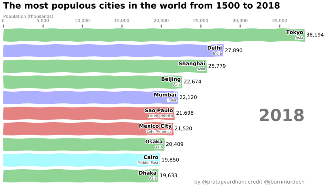
8、额外奖励,绘制 xkcd 风格的图形
with plt.xkcd():
    fig, ax = plt.subplots(figsize=(15, 8))
    draw_barchart(2018)
matplotlib 的 animations 使用说明
Matplotlib 中动画实现的原理跟其它一样,就是让多幅图连续播放,每一幅图叫做一帧(frame)。
生成动画的核心语句如下:
import matplotlib.animation as animation
from IPython.display import HTML
fig, ax = plt.subplots(figsize=(15, 8))
animator = animation.FuncAnimation(fig, draw_barchart, frames=range(1968, 2019))
HTML(animator.to_jshtml())
# or use animator.to_html5_video() or animator.save()
核心函数是animation.FuncAnimation(),接下来一起学习下如何使用此函数。
class matplotlib.animation.FuncAnimation(fig, func, frames=None, init_func=None, fargs=None, save_count=None, *, cache_frame_data=True, **kwargs)
参数说明:
- fig:进行动画绘制的 figure
- func:更新函数
- frames:传入更新函数的迭代值,即生成每一帧(frame)的参数
- init_func:初始函数
- fargs:传入更新函数的额外参数
- save_count:指定保存动画(gif 或 mp4)的帧数
- interval:指定帧间隔时间,单位是 ms
- repeat_delay:如果指定了循环动画,则设置每次循环的间隔时间
- repeat:指定是否循环动画
- blit:是否优化绘图
- cache_frame_data:控制是否缓存帧数据
核心方法说明:
- save(self, filename[, writer, fps, dpi, …]):将动画保存为文件(gif 或 mp4).
- to_html5_video(self[, embed_limit]):将动画 HTML5 动画
- to_jshtml(self[, fps, embed_frames, …]):将动画返回为 HTML 格式
参考链接: